

25/26 Premier League Season’s Kit Rankings: Retro inspirations, brilliant designs ahead of new season
As the 2025/26 Premier League season nears, The Athletic has ranked all 20 club kits, featuring nostalgic throwbacks and incredible new designs.
With English football’s top flight set to return next week, The Athletic’s kit expert Nick Miller has taken a close look at all 20 new home shirts, ranking them from the weakest designs to the standout favourites.
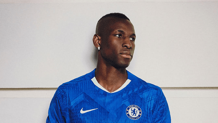
At bottom place is Chelsea. Despite the club’s status and resources, its new shirt is surprisingly underwhelming. “It’s just not doing anything,” Miller wrote. “A team this big should have a kit to match, but this doesn’t come close.”
[Photo Credit: Brentford Instagram]
In 19th, Brentford’s first-ever kit under new supplier Joma fails to leave a mark. “It looks like a decent League One kit,” Miller noted, “but not something you’d expect from a top-flight club.” A safe design, but not one that stands out.
[Photo Credit: West Ham United Instagram]
The Hammers, West Ham United, sit in 18th, with a shirt that tones things down too much. The claret remains, but the blue takes a backseat in a minimalistic approach that strips away the club’s usual visual identity. “It’s not bad,” Miller said, “but it doesn’t feel like West Ham.”
[Photo Credit: Aston Villa Instagram]
Aston Villa take 17th with a kit that feels overloaded. From gradient details to odd pattern placements, the result is more chaotic than classic. “It’s like four kits in one,” Miller remarked. “None of them quite working.”
[Photo Credit: Crystal Palace Instagram]
Just ahead in 16th, Crystal Palace suffers from a single design choice that throws everything off. The traditional body looks fine, but the white block stripes on the sleeves disrupt the flow. “Those sleeves ruin an otherwise tidy design,” Miller commented.
[Photo Credit: Brighton & Hove Albion Instagram]
Brighton & Hove Albion sit in 15th with a kit that’s clean and traditional, but perhaps too safe. The blue and white stripes are expected, but there’s little else to capture the imagination. “There’s nothing wrong with it,” Miller said. “But nothing is exciting about it either.”
[Photo Credit: Bournemouth Instagram]
Bournemouth’s shirt ranks 14th, featuring a wavy pattern inspired by the coastline. While the concept shows ambition, the final result leaves some scratching their heads. “Creative idea, but the execution lets it down,” Miller observed.
[Photo Credit: Burnley Instagram]
In 13th is Burnley, whose design features squiggly lines meant to represent the hills around Turf Moor. It’s a thoughtful idea, but it doesn’t quite land visually. “You need the explainer to get it,” Miller noted.
[Photo credit: Fulham Instagram]
Fulham comes 12th with a shirt that’s neat and monochrome. It’s sharp, for sure, but plays it safe, perhaps too safe. “Smart, sure,” Miller said. “But bordering on boring.”
[Photo credit: Newcastle United Instagram]
Newcastle United claim 11th with a bold departure from their usual stripes. The blurred pattern, inspired by shepherd’s checks, has its supporters and detractors alike. “It’s unique and bold, but not for everyone,” Miller wrote.
[Photo credit: Manchester City Instagram]
Just inside the top 10, Manchester City’s home shirt features a diagonal sash—a nod to their 1960s kits. While unusual for today’s City look, it’s a risk that pays off. “You’d think sashes belonged to River Plate,” Miller said, “but somehow, this works for City.”
[Photo credit: Manchester United Instagram]
In 9th, Manchester United go modern with black trim and subtle patterns that pay tribute to The Theatre of Dreams, Old Trafford. Whether or not fans pick up on the detail, the kit feels sharp. “It’s supposed to reference the stadium,” Miller noted, “but most won’t notice without a guide.”
[Photo credit: Wolves Instagram]
Wolves earn 8th place with a retro-inspired kit from their in-house brand Sudu. The result is clean, bold, and distinctive. “It’s got swagger and history,” Miller said. “A strong effort.”
[Photo credit: Nottingham Forest Instagram]
Nottingham Forest sit comfortably in 7th, rolling back the years with a shirt that draws from the early Premier League era. “It’s nostalgic without being dated,” Miller commented, referencing its resemblance to their 1992–93 strip.
[Photo credit: Arsenal Instagram]
In 6th, Arsenal returns to a classic look with red shirts, white sleeves, and simple Adidas branding. “Fans have been begging for this simplicity,” Miller noted. “It delivers.”
[Photo credit: Tottenham Instagram]
Tottenham Hotspur are ranked 5th, with a sleek white kit that subtly modernises their usual design. While clean and stylish, the sponsor logo might be the only blemish. “A very modern Spurs shirt,” Miller wrote. “Though the sponsor is a bit much.”
[Photo credit: Liverpool Instagram]
Liverpool claim 4th place in a triumphant reunion with Adidas, their first kit with the brand since 2012. Drawing from their mid-2000s aesthetic, the shirt feels like a return to identity. “It’s a proper Liverpool shirt again,” Miller said. “Ignore the Wonderland video.”
[Photo credit: Leeds Instagram]
Leeds United takes a surprise 3rd, despite Red Bull branding stirring mixed reactions. The design itself is striking, clean, and sharp. “You hate that you like it,” Miller joked. “But it’s beautifully done.”
[Photo credit: Sunderland Instagram]
Even more surprising is Sunderland in 2nd. Promoted and proud, they’ve partnered with Hummel to deliver a kit steeped in tradition. “This is how you do a heritage kit,” Miller said. “It just looks right.”
[Photo credit: Everton Instagram]
Everton tops the list in 1st place. In a season where kits have leaned heavily on nostalgia and symbolism, Castore’s design for the Toffees gets everything right, from subtle nods to the Mersey to echoes of their 1980s dominance. “It’s everything a modern kit should be,” Miller concluded.

We have recently deactivated our website's comment provider in favour of other channels of distribution and commentary. We encourage you to join the conversation on our stories via our Facebook, Twitter and other social media pages.


More from Peoples Gazette

Agriculture
FG tasks ECOWAS on leveraging financing strategies for agroecology
The federal government has urged stakeholders in the agriculture and finance sectors in the West Africa region to leverage financing strategies to enhance agroecology practices

Politics
Katsina youths pledge to deliver over 2 million votes to Atiku
“Katsina State is Atiku’s political base because it is his second home.”

Heading 1
Tinubu okays implementation of key measures for defined benefit scheme pensioners
Mr Tinubu also approved the adoption of a proposed pension harmonisation policy for DBS pensioners in the 2026 pension budget.

Hot news Home top
Stock market sheds N516 billion after weeks of bullish rally
The Nigerian Police Force Microfinance Bank lost by 7.25 per cent, closing at N3.20 per share.

Economy
Petrol’s gantry price remains N850, facility fully operational: Dangote Refinery
“The Dangote Petroleum Refinery is fully operational. There has been no shutdown,” said a statement by the company.

Education
Lagos lawmaker distributes 400 free GCE forms
He said the initiative aligns with President Bola Tinubu’s efforts through the NelFund.

Hot news Home top
2027: PDP vows to sanction members endorsing Tinubu for second term
He said that of serious concern was the persistent public media outbursts against PDP by some prominent members.

Heading 1
Peter Obi proposes five-year single term for Nigerian president
Mr Obi said he would ensure that political parties were bigger than the elected people.


